── Attaching core tidyverse packages ──────────────────────── tidyverse 2.0.0 ──
✔ dplyr     1.2.0     ✔ readr     2.1.6
✔ forcats   1.0.1     ✔ stringr   1.6.0
✔ ggplot2   4.0.2     ✔ tibble    3.3.1
✔ lubridate 1.9.5     ✔ tidyr     1.3.2
✔ purrr     1.2.1
── Conflicts ────────────────────────────────────────── tidyverse_conflicts() ──
✖ dplyr::filter() masks stats::filter()
✖ dplyr::lag()    masks stats::lag()
ℹ Use the conflicted package (<http://conflicted.r-lib.org/>) to force all conflicts to become errors
Introduction
When you have two categorical variables, and you want to test for an association between them, the go-to method is a chi-squared test. For example, you might have a survey of eyewear worn by people who classify themselves as male or female:
Rows: 2 Columns: 4
── Column specification ────────────────────────────────────────────────────────
Delimiter: " "
chr (1): gender
dbl (3): contacts, glasses, none

ℹ Use `spec()` to retrieve the full column specification for this data.
ℹ Specify the column types or set `show_col_types = FALSE` to quiet this message.
eyewear
Is there a tendency for one gender to prefer a certain type of eyewear over the other, or, if you know a person’s gender, can you predict what they are likely to wear on their eyes? That is to say, is there an association between eyewear and gender?
With a P-value of 0.0001, there certainly is an association.
The above is the way contingency tables are usually laid out, but is not the most convenient for graphs (and, as we see later, for log-linear modelling):
Now we can draw a graph to see what kind of association there is:
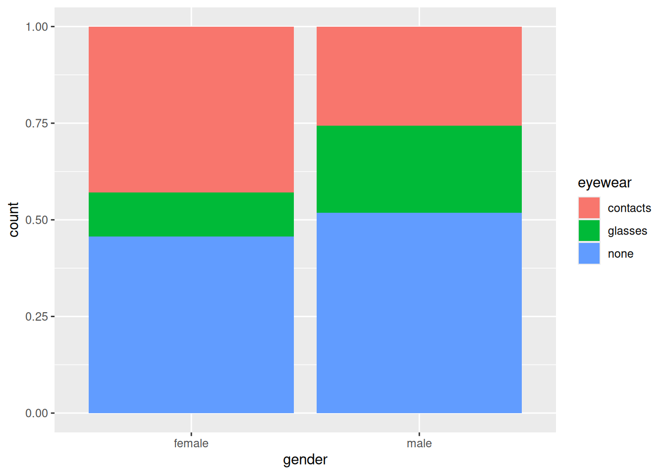
ggplot(eyewear1, aes(x = gender, y = count, fill = eyewear)) +geom_col(position ="fill")
Females are more likely to wear contacts and less likely to wear glasses than males.
A word about the graph: this is a bar chart, but one with two properties:
the frequencies are not counted from the data, but given in a variable, so we use geom_col rather than geom_bar. In geom_col, the y aesthetic contains the frequencies.
the bars of the bar chart are stacked, but also scaled to have unit height (by dividing by the totals for that bar). The \(y\)-axis label count is thus a misnomer; they are proportions rather than counts.
In a contingency table, one of the variables is often logically an outcome, eyewear here. Putting the logical explanatory variable as x and the logical outcome as fill enables us to compare the size of the coloured rectangles for each value of the variable on the \(x\)-axis (which is the appropriate way to do it).1
Log-linear models
For two categorical variables, a chi-squared test followed by a graph (if the result is significant, to understand the association) is a straightforward way to go.
But what if we have more than two categorical variables? The picture can be more nuanced, in that there can be associations between only some of the categorical variables, and we now want to do two things: first, find out which categorical variables are associated, and second, for those that are, understand those associations.
The second thing can be done by drawing a graph like the one above, but the first needs a new modelling procedure: a log-linear model. This models the frequencies as having a Poisson distribution, with the log of the frequency having a linear relationship with effects for each categorical variable and possibly their interactions. A log-linear model is a generalized linear model with Poisson family (using the default log link).
One point that can be tricky to understand is that one or more of the categorical variables can be logically a response (like eyewear above), but as far as the modelling is concerned, all categorical variables are explanatory, with the frequency variable being the response.
The starting point is to fit a model including all interactions between (model) explanatory variables, with the frequency variable as (model) response. Let’s illustrate with the eyewear data, using the “long” layout (which is needed for log-linear modelling):
The next step is to see what can be removed from this model, which is most easily done with drop1:2
drop1(eyewear1.1, test ="Chisq")
The interaction between gender and eyewear is significant, and the P-value is close to the one from the chi-squared test. In this model, this indicates a significant association between the categorical variables whose interaction is significant (in other words, the same conclusion as for the chi-squared test, with almost the same P-value).
Technical aside: the P-values from the log-linear model and from the chi-squared test are very close, but not exactly equal. Letting \(O\) denote an observed frequency and \(E\) the corresponding expected frequency, the chi-squared test statistic is the sum over all cells of \((O - E)^2 / E\), the so-called Pearson chi-squared, while the log-linear test statistic in this case is the sum of \(O \ln(O / E)\), the likelihood ratio test statistic. These are not the same but are often very similar. End of technical aside.
Which airline to fly?
Let’s do a more interesting example. Two airlines, Alaska Airlines and America West, fly into various airports in the west of the US. Each flight is either on time or delayed at its destination. Is one airline more punctual than the other, and does this depend on which airport you are looking at? This time we have three categorical variables: airline, airport, and on time/delayed, which we will call status. I found these data in a textbook, laid out like this:
               Alaska Airlines       America West
Airport       On time    Delayed   On time    Delayed
Los Angeles      497        62        694       117
Phoenix          221        12       4840       415
San Diego        212        20        383        65
San Francisco    503       102        320       129
Seattle         1841       305        201        61

Total           3274       501       6438       787
This is not modelling-friendly, and not even tidy (in the tidyverse sense of the term). There is a further problem in that we have two rows of headers (often the way a three way table is displayed). I condensed the two rows of headers into one:
We need to get each of the three categorical variables in its own column, with one column of frequencies. This uses the variant of pivot_longer with two variable names to go into names_to, separated by an underscore:
and then we see what if anything we can get rid of. drop1 is nicer than summary for two reasons: (i) it only displays what actually can be dropped (the highest order interactions in this kind of model), (ii) when a categorical variable has more than two levels (such as airport here), summary only shows how each level compares to the baseline, not whether there is an effect of that categorical variable as a whole.
So:
drop1(punctual.1, test ="Chisq")
The three-way interaction is not significant, so that term can be removed from the model. I like update for this task, because the model is complicated enough that copying, pasting, and editing the previous glm code risks fitting the wrong model next:3
punctual.2<-update(punctual.1, . ~ . - airport:airline:status)drop1(punctual.2, test ="Chisq")
There are three two-way interactions up for grabs, but they are all significant, so this is where we stop. The modelling indicates there are significant associations between airport and airline, airport and status, airline and status.
As far as the modelling is concerned, all three categorical variables are “explanatory”, but from a logical point of view, status seems like an outcome: particular airlines or airports cause a flight to be on time or delayed. Our main interest in this kind of modelling is “what is associated with the logical outcome?”. The log-linear modelling says that there is an effect of airline on status, and also a separate effect of airport on status (but not an effect of the combination of airline and airport on status, because the airport:airline:status interaction was not significant).
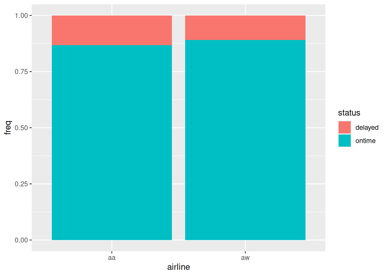
The airline - status association was what interested us most, so let’s go after that, remembering that in our graphs, the logical outcome should be fill:
ggplot(punctual, aes(x = airline, y = freq, fill = status)) +geom_col(position ="fill")
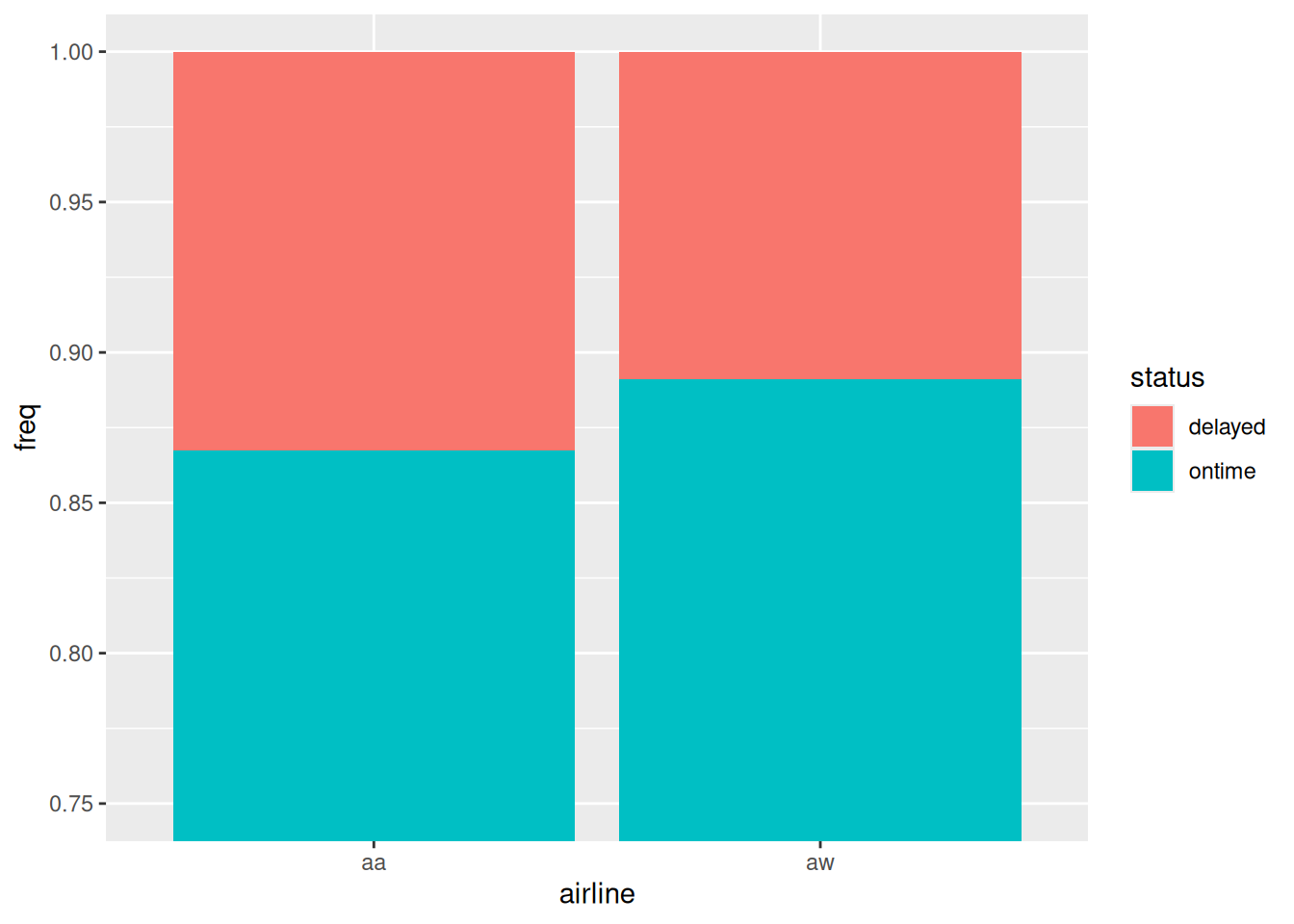
This is a bit hard to see, so let’s zoom in on the \(y\)-axis:
ggplot(punctual, aes(x = airline, y = freq, fill = status)) +geom_col(position ="fill") +coord_cartesian(ylim =c(0.75, 1))
Figure 1
Figure 1 says that Alaska Airlines is a bit less punctual than America West overall, about 87% on time vs. about 89% on time. So, we seem to have an answer to our question. But we have two other significant associations to explore. Bear in mind that the graph above is “collapsed” over airports.
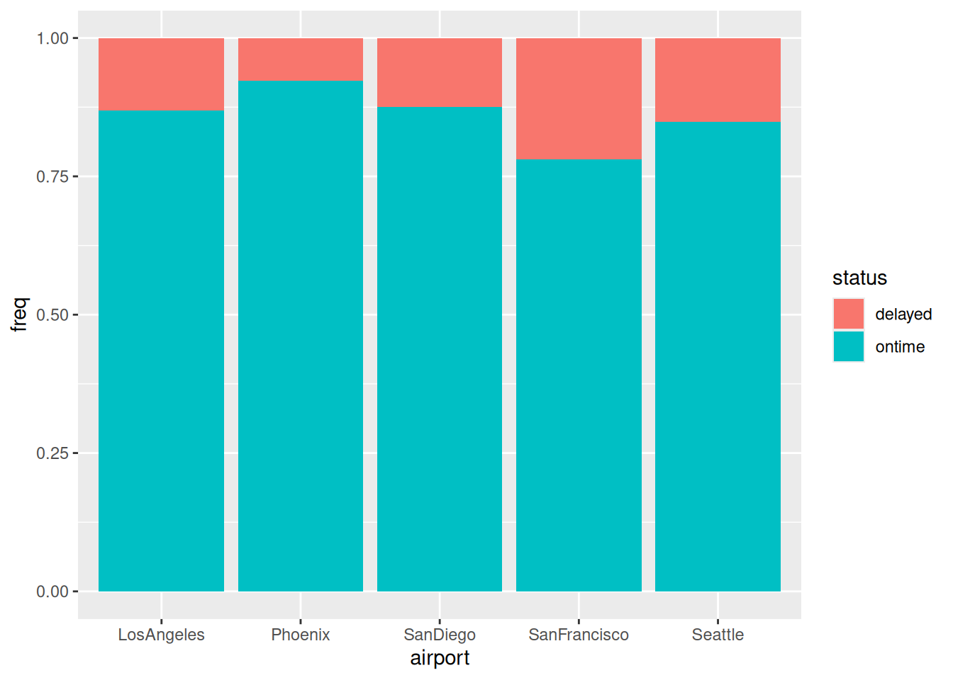
The next most interesting association is the other one with status, namely airport by status:
ggplot(punctual, aes(x = airport, y = freq, fill = status)) +geom_col(position ="fill")
Figure 2
Figure 2 says that the airports differ a fair bit in terms of punctuality, from over 95% on time at Phoenix down to only just over 75% at San Francisco.4
So, the airports are different in terms of punctuality, but the status-airline graph above aggregates over the different airports. Some of you may be beginning to feel uneasy at this point.
It is usually only associations with the logical outcome variable that concern us, but we have one more association that we can investigate, airport by airline. Neither of these are logical outcomes, so it doesn’t matter which is x and which is fill, but there are more airports than airlines, so I’ll put airports on the \(x\)-axis:
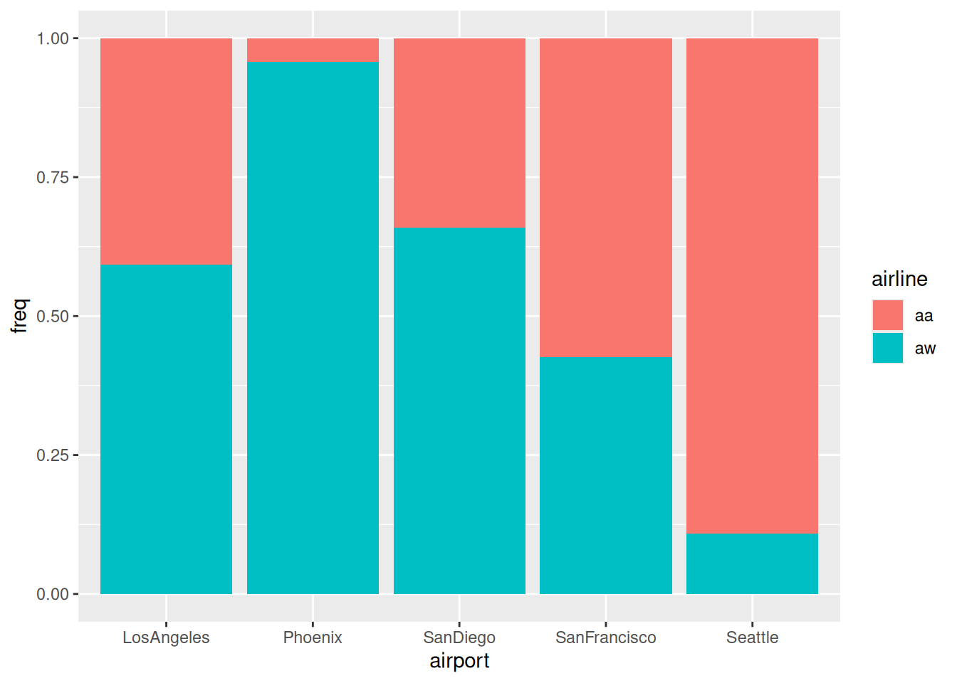
ggplot(punctual, aes(x = airport, y = freq, fill = airline)) +geom_col(position ="fill")
Figure 3
The airports are actually very different in terms of which of the airlines fly into them: almost all of the flights into Phoenix are America West, and most of the flights into San Francisco and Seattle are Alaska Airlines.
Figure 2 and Figure 3 tell us that there is a potential bias here: America West fly mostly into Phoenix, where it is easier to be on time, and Alaska Airlines fly mostly into Seattle and San Francisco, where it is more difficult to be on time. Maybe the punctuality picture for Alaska Airlines is better than Figure 1 suggests?
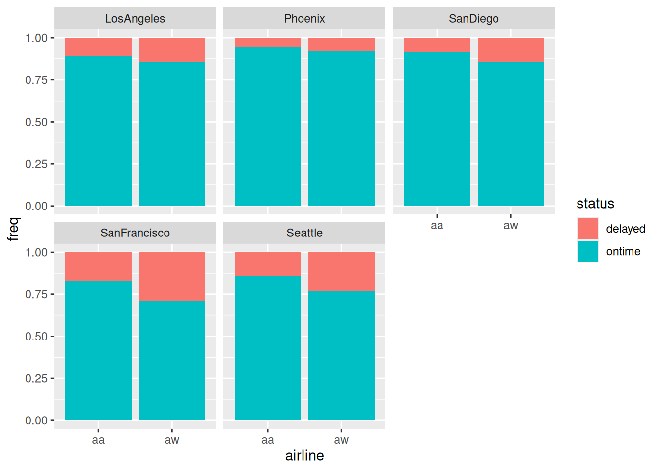
Let’s compare apples with apples: make a graph of the punctuality of each airline at each airport, since the airports do differ one from another:
ggplot(punctual, aes(x = airline, y = freq, fill = status)) +geom_col(position ="fill") +facet_wrap(~ airport)
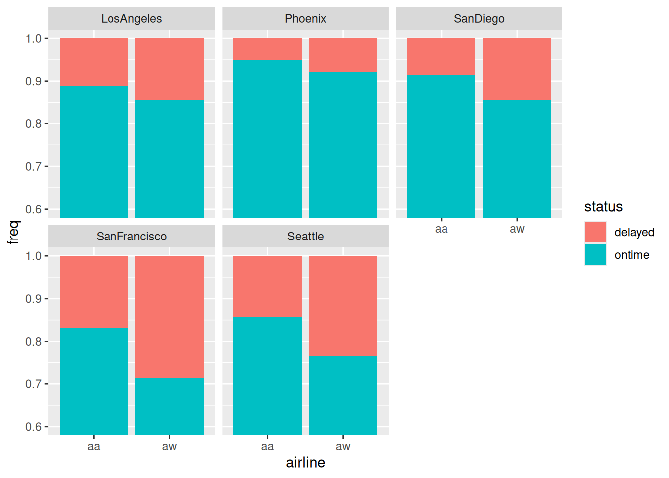
Once again, zooming in on the \(y\)-axis seems to be the thing:
ggplot(punctual, aes(x = airline, y = freq, fill = status)) +geom_col(position ="fill") +facet_wrap(~ airport) +coord_cartesian(ylim =c(0.6, 1))
Figure 4
and now we see that Alaska Airlines is more punctual at every single airport than America West, despite being less punctual overall! In other words, we have unearthed a Simpson’s Paradox.
Figure 4 is the kind of thing we would draw to investigate a three-way association. In this case, airport:airline:status was not significant so we didn’t look at this graph before. The kind of thing that would have made the three-way association significant is if one airline was more punctual than the other at some airports and less punctual at others. Here, Alaska Airlines is more punctual at every airport, and, in Figure 4, by about the same amount everywhere, so that the three-way interaction was not significant. What prompted us to look at this graph was the potential for bias by aggregating over airports in Figure 1 that seemed to be very different from each other in Figure 2 and Figure 3. That small difference in punctuality between airlines in Figure 1 was significant, but not in the way we thought!
Ovarian cancer, a four-way table
In a 1973 retrospective study, 299 women who had previously been operated on for ovarian cancer were assessed, and four variables measured:
stage of cancer at time of operation (early or advanced)
type of operation (radical or limited)
X-ray treatment received (xray) (yes or no)
10-year survival (yes or no)
Logically, survival is the outcome, so we will be mainly interested in associations with that.
Rows: 16 Columns: 5
── Column specification ────────────────────────────────────────────────────────
Delimiter: " "
chr (4): stage, operation, xray, survival
dbl (1): freq

ℹ Use `spec()` to retrieve the full column specification for this data.
ℹ Specify the column types or set `show_col_types = FALSE` to quiet this message.
cancer
Strap yourself in. Step 1:
cancer.1<-glm(freq ~ stage * operation * xray * survival,data = cancer, family ="poisson")drop1(cancer.1, test ="Chisq")
The four-way interaction (thankfully) comes out:
cancer.2<-update(cancer.1, . ~ . - stage:operation:xray:survival)drop1(cancer.2, test ="Chisq")
None of the three-way interactions are significant (at least in this model), so we remove the least significant of them:
cancer.3<-update(cancer.2, . ~ . - stage:xray:survival)drop1(cancer.3, test ="Chisq")
and none of these are significant, so remove the least significant of them:
cancer.4<-update(cancer.3, . ~ . - operation:xray:survival)drop1(cancer.4, test ="Chisq")
Now there is a two-way interaction up for grabs, and finally something is significant. The two-way interaction has the highest P-value, so out it comes:
cancer.5<-update(cancer.4, . ~ . - xray:survival)drop1(cancer.5, test ="Chisq")
and on we go:
cancer.6<-update(cancer.5, . ~ . - stage:operation:survival)drop1(cancer.6, test ="Chisq")
It looks as if we are beginning to get somewhere. One non-significant effect here:
cancer.7<-update(cancer.6, . ~ . - operation:survival)drop1(cancer.7, test ="Chisq")
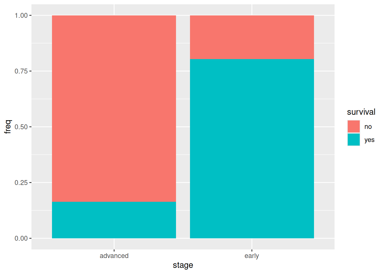
and now everything is significant, so we breathe a sigh of relief and see what’s left. Out of the two remaining significant associations, only one involves our logical outcome survival, and that is stage:survival:
ggplot(cancer, aes(x = stage, y = freq, fill = survival)) +geom_col(position ="fill")
that is to say, most of the patients whose cancer was in the early stage survived for 10 years, and most of those whose cancer was in the advanced stage did not.5
The people who collected these data were probably looking for an effect of the actual treatments, but both xray:survival and operation:survival disappeared from our model by virtue of not being significant, so there is no evidence of either the X-ray treatment or the type of operation having any effect on survival.
That other association is of less interest, but we can still look at it:
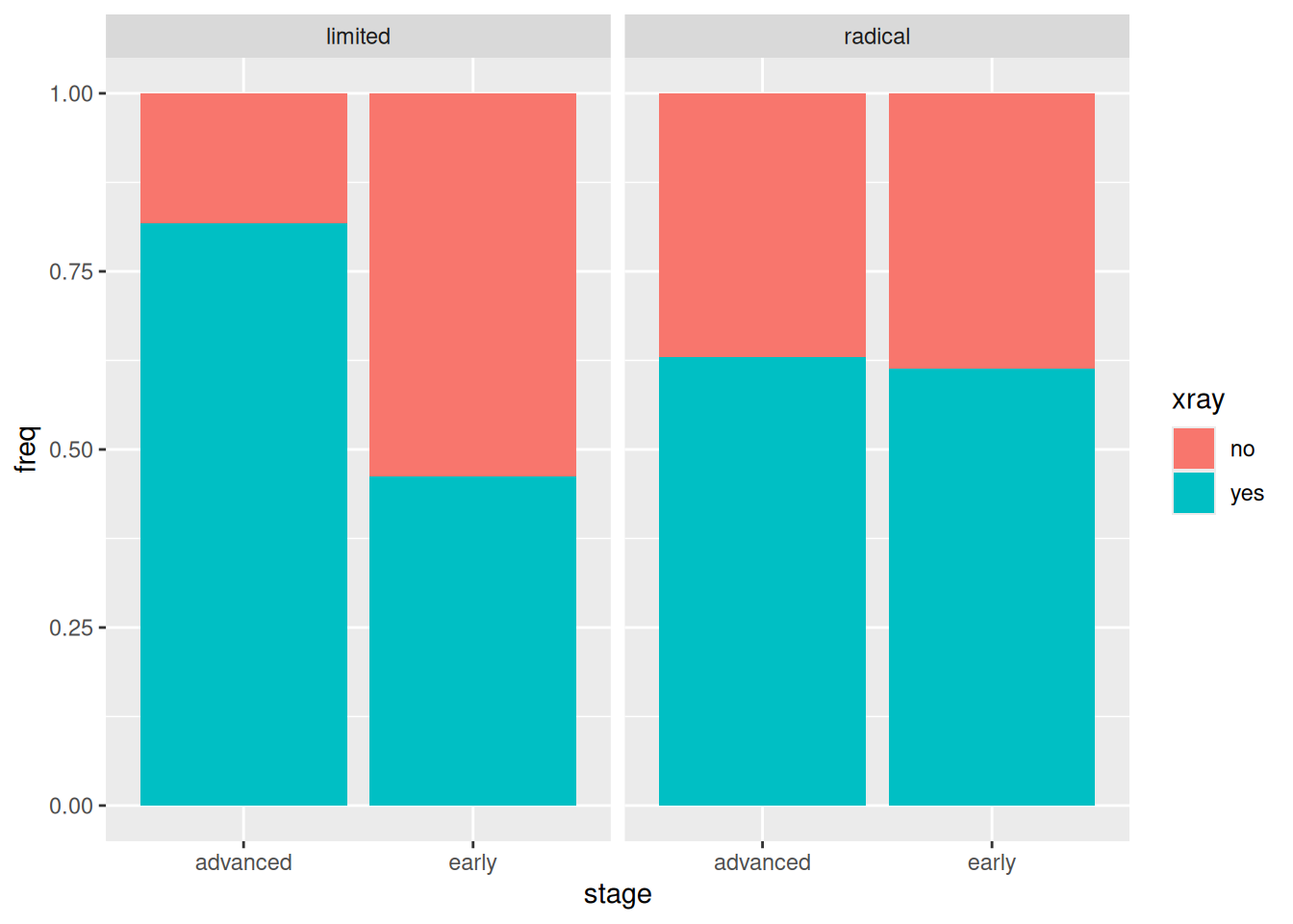
ggplot(cancer, aes(x = stage, y = freq, fill = xray)) +geom_col(position ="fill") +facet_wrap(~ operation)
If a patient had the limited operation, whether or not they also had the X-ray treatment depended on the stage of cancer (more likely if it was advanced). On the other hand, if the patient had the radical operation, whether or not they had the X-ray treatment had nothing to do with the stage of cancer.
This last, of course, has nothing to do with survival.
Footnotes
“For each type of eyewear, this many of the respondents are male or female” seems to make less sense.↩︎
This is a generalized linear model, so the right test is based on the deviance / likelihood ratio, not \(F\).↩︎
The next model is actually freq ~ (airport + airline + status)^2 in R notation: that is, including all the two-way interactions but no higher.↩︎
Canadians of a certain age will remember “San Francisky? So how did you came? Did you drove or did you flew?”, from (a much younger) Eugene Levy’s character Sid Dithers on SCTV. I personally can’t believe how much Dan Levy’s character on Schitt’s Creek looks like his dad used to look.↩︎